Tuesday, June 2, 2015

Found: Five Fabulous Postcard Designs

Today's selection of postcards vary in both topic and approach, but they all have one thing in common: they're examples of great design.
---
Designers  Michael Ryan Smith and Joseph Mueller have taken the minimalist approach with this postcard, and it works wonderfully. The rich dark purple background really makes the colorful bold lines pop. The text, like the line-work, is used sparingly. We're presented with only the vitals, in a clear and concise fashion.

--- 
This postcard designed by David Van Landingham does a great job at highlighting the services offered by MCI (Makeup Call Inc.), while also providing an example of their makeup work. The dark color scheme of the front contrasts nicely with the lighter backside. In addition, the grungier walls and shadows of the front contrast with the serene formality of the back, subtly reinforcing the idea that this company does more than weddings.


---
Like we've mentioned above, designer Alisha Collins Bucca has wisely opted to go light on text. Further, this card features more imagery, which is smart because it lets the viewer know just how much variety they're in store for if they attend the event. It's enticing and informative.
 ---
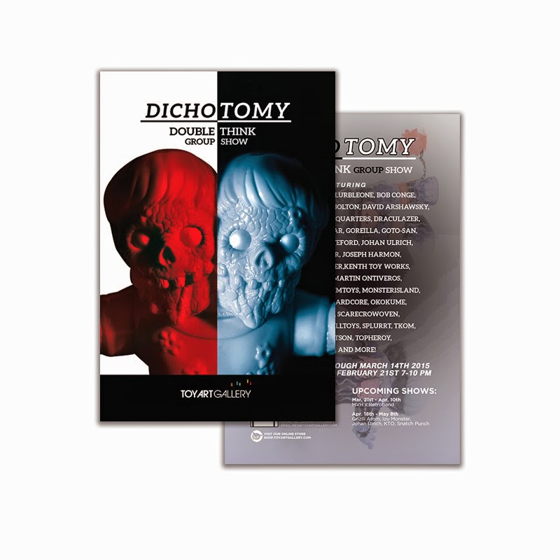
Nikole Grad utilizes striking artwork to capture our attention, and a useful calendar to ensure the postcard hangs around. The longer a recipient holds on to it, the more likely they are to attend the event. 
 ---
This postcard by Heather Cook features striking imagery with an intensity you typically don't see in youth sports promotional pieces. The front clearly appeals to children directly, because every kid wants to be taken seriously and feel tough. The back however, is all about the parents. It includes information about savings, how to sign up, and a call to action.
---
And that about wraps it up for today. If you enjoyed these designs, or if you have great designs of your own that you'd like us to check out, just leave a comment below. We'd love to hear from you!

Wednesday, May 13, 2015

Seven Real Estate Postcard Designs With Curb Appeal


Savvy real estate agents are doing more than just baking cookies before an Open House. Now they're creating a multi-channel marketing plan.  And this includes mailing real estate postcards to announce new listings, sold listings or to promote their services in general. 

Unfortunately, if you look around the web you'll realize many of these postcards aren't very pretty... 
So we thought it would be helpful to spotlight the best postcard designs we've come upon. Here are seven truly great postcard designs for real estate:


-1-
We love the simplicity of this card by BrightSpot Creative. The vitals are all here. We know the company name, we have an understanding of what they can do, and the black and white photos on the bold colorful background really pop.

 -2-
Kennedy Real Estate put together something really great. This postcard shows a beautiful property and a pleasant looking real estate agent. The contact information is clearly visible and well organized, but what really set the card apart for us was the artistic touch of the green apples. 

Apples are a common motif in their promotional material and branding, and because they're not home related in an obvious way, it feels fresh (pun fully intended) and surprising.


-3-
Sergio Reyes really nailed this one. The cards objective is clear: showcase a property. The photographs are pleasing and prominent. The type is minimal and informative. There's a great sense of visual hierarchy here: the most important information is the largest, while other key details are differentiated by color. It's basic design textbook stuff, but it's stuff people often forget.

 -4-
limelight marketing created a beautiful card for real estate agent Nancy Fong. The colors are pleasant, the information is clear, and perhaps most importantly, the portrait is tasteful. Many real estate agents like to show themselves on their promotional material, and it makes sense. An agent's picture goes far to help establish trust and rapport.  (Just be careful -- no picture is better than a bad picture.)

Thankfully, that clearly isn't an issue here.  Nancy, and the room setting behind her, looks great!

-5-
I really enjoy how up-front Marsid-M&M Group's postcard is. It's quite literally 'inviting.' And  information is organized and clear. What's worth noting about this postcard is that it makes good use of variable data to customize the postcard based on who and where it's going.
Personalizing postcards always makes a bigger impact.


-6-
This postcard for REALTOR® Sarah Martin Properties by designer Ela Leitner is simple but elegant. The clever thing here is the list of useful phone numbers on the side. I'm sure this increases the likelihood of recipients holding on to it.


-7-
And last but certainly not least, we have this Foldup Magnet Mailer from our friends at magnetbyMail and designers at stocklayouts.com

It has all the mailing ease and convenience of a regular postcard, but it opens up and unfolds so you can fit more information about the property inside. A big issue we often see with Realtors postcard designs is cramming too much information on a card. It becomes overwhelming and uninviting to the viewer. The Foldup version is a great solution.  The extra space the Foldup offers
really makes a difference. 

Oh, and the Foldup comes with a useful refrigerator magnet -- so potential clients will have the agents's information for a long time to come.


----

Do you have examples of a great postcard design?  We'd like to see them!  Simply use the Comments feature of this blog and let us know a little about your project -- we'll respond with how to send your images to us. Thank you!


----


Friday, May 1, 2015

Six Healthcare Postcard Designs That Made Us Smile


Today's spotlighted postcard designs prove that health and happiness go hand-in-hand. All of our selections are from healthcare marketing, and as you'll soon see, they have a lot in common. 

----

This postcard by Children's Hospital Boston uses the time-tested formula of a cute kid with a big smile. Only this time, there's an added impact because the card is advertising the cleft lip and palate division of the hospital. We're actually looking at the positive results of a successful medical procedure.
Source: Brett Pollard 
postcard design for childrens hospital
---

Crosby created the following two cards for the Veterans Health Administration.

What's interesting about this first card is that it's targeting someone who's close to the veteran, rather than the veteran. It recognizes how important the spousal support system is for veterans. This idea is reinforced by the very photogenic and very happy couple.

Also, please note the nice big Call To Action "Every Veteran Should Enroll."  If you want to make your postcard design effective, make sure you have a Call To Action that stands out.
design for va healthcare
This second postcard also focuses on family, although in this case it's appealing more to veterans directly. They want to be there for their children. The Air Force shirt the dad's wearing is a nice subtle touch. It feels like a natural moment instead of in-your-face military advertising. It's also nice to see he's playing catch with his daughter. The military has taken many steps to ensure gender equality lately, and I can't help but wonder if they intentionally chose to show a girl doing an activity many people would have associated with boys in the past.   
postcard design for veteran health care

---
This postcard the Kidd Group designed for Houston Healthcare is deceptively simple. There's copy about a digital mammography, and a woman sitting in the woods. Is that it? Well no, not if we look a little closer. The woman's sitting on a brick wall, something we subconsciously associate with strength and sturdiness. She's smiling, so we know she's happy with the choice she made. And speaking of the choice, pay attention to the position of the white box and remember this is about mammography.
 Pretty clever, right?

postcard design for mammography
---
This postcard for Timber Dental by OMAC Advertising is fairly self-explanatory. A beautiful family with beautiful smiles, what's not to like? Like the cleft lip postcard, not only is this demonstrating happiness, it's also showing quality results. It says if you go to Timber Dental, you can have a beautiful smile too.
poscard design for dentist
---
Finally, we have a design for postcard magnets from magnetbyMail. It's unique from the others because it has a removable magnet that can be placed on fridges and filing cabinets. However, from a design standpoint, it's very similar to Timber Dental. So rather than focusing on the smiling family again, I'd like to point something out that's present in this card as well as quite a few of the others: Nature

If we're being honest, most people don't enjoy the dentist or doctor's office. It's an uncomfortable environment and often times the sacrifices that have to be made for the sake of sterility bring about a certain... ambiance. So it only makes sense to show the great outdoors. It's serene and peaceful. Those are pretty good qualities to associate with dentistry.
postcard marketing for dentist

----


Do you have examples of a great postcard design?  We'd like to see them!  Simply use the Comments feature of this blog and let us know a little about your project -- we'll respond with how to send your images to us. Thank you!


----

Tuesday, April 21, 2015

Verna Bhagrava Shakes Things up with Simplicity


For today's design spotlight, I wanted to take a look a this great minimalist card created by Creative Director Verna Bhargava and her team. Their objective was to design something that encouraged people of various disciplines and backgrounds, everyone from scientists to artists, to attend a symposium about the 1989 Loma Prieta earthquake. I'd say they succeeded. 


The postcard brilliantly merges science with design. The winding curves covering the main side of the postcard are a clever nod to the Richter scale. 

And by using a textured brush instead of uniform solid lines to create the waves, the viewers mind is able to treat the shapes more abstractly. It's like looking at a cloud - everyone's going to interpret it a little differently. When I look at them, my mind conjures up images of shaky mountains and collapsing roads.

It's not pleasant imagery by any means, but it's exciting and it lends a sense of urgency to an event that occurred 25 years ago.


The back of the postcard demonstrates just how confident these designers are. There's only one bold brush stroke. Everything else is text. But you know what? It works. It's aesthetically pleasing, it draws the eye, and it makes a topic some might find mundane interesting again.

Kudos to Verna and everyone involved. 


Interesting side note: As if this great design wasn't enough to motivate people to attend, Mother Nature decided to lend a helping hand - Verna and her team launched this project 1 day after California was hit by a 6.1 earthquake.

----
Do you have examples of a great postcard design?  We'd like to see them!  Simply use the Comments feature of this blog and let us know a little about your project -- we'll respond with how to send your images to us. Thank you!

----

Friday, April 17, 2015

Good Design at Cherry Tree Bears Fruit

We're all about promoting good design and the designers that make it happen.

This week, that's led us to the postcard designs of Susan R. Kirshenbaum and her design firm Cherry Tree Creative.

Yes, the design work is tops.  But we also like the considered and deliberate approach that Cherry Hill takes.  It reminds us of the dozens of choices -- and decisions -- that go into producing a design that works in the marketplace.

--
A postcard design for JCCSF Fitness Center:


The postcard design for JCCSF Fitness Center is created, as the designer notes, to stand apart from the "hard sell fitness membership offers and appeal to those looking for a more thoughtful, healthy individual lifestyle."

One way to stand apart is to use a tranquil, black and white image.  The layout also makes good use of white space and goes easy on salesy copy.

You feel rejuvenated just looking.

---
JCCSF Summer Camp:

To promote the JCCSF Summer Camp, Cherry Tree designed a series of postcards to create a sense of curiosity and anticipation to announce the coming camp season.

The postcards are presented as a teaser series where each card reveals a bit more than the previous one.


Curiosity, anticipation, discovery, fun -- the elements built into the postcard design -- are exactly the features most moms and dads are hoping fill their child's summertime.

If the purpose of the postcard is to remind parents of the coming camp season, and to drive those parents to the camp website for details and registration, then this postcard series hits the mark.


----
Do you have examples of a great postcard design?  We'd like to see them!  Simply use the Comments feature of this blog and let us know a little about your project -- we'll respond with how to send your images to us. Thank you!

----


Saturday, April 11, 2015

Kudos To Ojan

If you boil down all the elements that go into designing a great postcard, what do you have when you lift the lid?

You have a postcard that can change your mind.

And when I came across a series of postcards from Indonesian designer OJANTO WORK, that's exactly what happened to me.

The postcards are maps of various cities throughout Indonesia.  Ojan states that each card is designed with colors and perspective that reflect the uniqueness of the city it represents.

Perhaps I'm drawn to the maps (guess I'm a closet map lover).  And I'm definitely attracted to the bright colors and bold lines.  I like the innocence of the graphics and the professional crispness of the execution.  I see the influence of textile design, and palettes of colorful inks being pulled through a screen.

Ojan wonders if the designs might help convince someone to come visit a vast and varied country. 

I think it has.

---
OJANTO WORK from Yogyakarta, Indonesia
A catalog of postcards are on Pinterest


Yogyakarta
 
 
--
Temanggung


--
Banda Aceh


--
Bali


--
Jakarta


###

Wednesday, April 8, 2015

Kudos: April of Drop Designworks


---

It's easy to see why this great postcard designed by April of Drop Designworks caught our eye. It's cute, clever, and most importantly, it's clear what the message is.

On the front of the card, I love how April effectively conveys two messages by simply inverting the colors. It causes us to read the headline in two different ways, without being confusing.

This creative approach saves space and prevents the postcard from appearing cluttered.

The use of a textile texture is also a subtle but brilliant touch. It's interesting visually, and it's a clever nod to the fact that alpaca are commonly used for their fiber.

It's great when a design is interesting to look at, but it's even better when that interesting design is intrinsically tied to the subject matter.

The card also excels from a visual hierarchy standpoint. The information is conveyed efficiently thanks to prominent headlines and sparingly used copy.

The sponsoring organization is clearly presented, and there's just enough whimsical imagery to keep the card playful without losing a sense of professionalism.


Overall this card definitely gets our seal of approval. Great job, April!

----
Do you have examples of a great postcard design?  We'd like to see them!  Simply use the Comments feature of this blog and let us know a little about your project -- we'll respond with how to send your images to us. Thank you!

----

Monday, April 6, 2015

Why Your Next Postcard Design Could Come From Etsy

What makes postcard designer ZeusVintage noteworthy is the web platform they use: Etsy.

The Doncaster, England designer creates custom postcard layouts for hire, or "bespoke postcard design" as they say.   And if their web examples reflect the typical fair, then we'd say 'thumbs up'.

The Etsy platform is traditionally used by artisans and craftsmen, but not so much by print designers. 

The selection of Etsy reflects a trend where print designers are looking for new ways to promote themselves digitally, and web platforms like Etsy are happy to accommodate them.

---
ZeusVintage offers postcard design via Etsy:


---


---
Recently, Amazon has started promoting local businesses and now offers plumbers and electricians.   For Amazon, print designers and graphic artists are not far behind.
 
As designers 'break out' of the traditional web platforms, one wonders if this is an experiment that will stick.   The months ahead should prove interesting, as ecommerce continues to re-invent itself.
 
###


Tuesday, March 31, 2015

Six Super Postcard Designs On Behance

Looking for a postcard designer on the internet?  Check out Behance

Started in 2006, Behance has been on a mission to remove the barriers between creative producers and creative buyers. 

The site presents the portfolios of thousands of aspiring and accomplished artists, including photographers, illustrators, and yes, postcard designers.  

We've peered through hundreds of postcard designs saved on the Behance site.  Here are six that we especially like:

---
The first postcard is from Sara de la Mora, a Spanish designer based in London.  The card was prepared as part of a Yelp competition “Yelp’s Key To London”.

I love how the bookplate design draws you in.  You're transported to the comfort of your easy chair, an Agatha Christie paperback, and bam -- you realize you're on a journey in a Yelp ad.  Very slick, indeed.

[Want more information about Sara?  Check her website here.]
---
We're very impressed with the work of Yanviani Wongso, a design student from Singapore.  The postcard is effective -- promoting a gallery show -- as well as fresh and creative.  It's nice to see a designer who is playful with type, without creating a distraction, and without over powering the message.


---
Christopher Charles, from Long Beach, California,  is a designer at subplex.  His postcard design for a farmer's market is interesting because it features black and white photography.  Your eye is drawn to the red, and to the copy it contains.  It shows how much can be accomplished with just a color or two.


---
A postcard design from Bobby Jennings in Mesquite, Texas, shows how full color can work wonders.  Houghton Mifflin Harcort Publishing uses color and illustration to full effect -- to attract the eye, and present itself in a way that is quite approachable.


---
While at School of Art at Texas Tech University, New York's Elliot Salazar created a postcard design to help promote the school's First Friday event. 

The postcard's graphics are somewhat complex and this has a positive effect.  First, you are drawn to them.  Then you spend a moment examining them.  Before you know it, you've invested yourself in the design and want to learn more about the postcard's message. 

It's quite an accomplishment to pull someone from their  daily hub-bub, and into your message -- even if its only for fifteen seconds.

[Want more information about Elliot?  Check his website here.]


---
Certainly, Kimberly Wray has found her calling.  The Glasgow designer has created a postcard that promotes a prayer event for Scripture Union Scotland.  And she has done it in a way that looks casual and genuine.  This is especially appropriate for the youth audience the postcard needs to reach. 

[Want more information about Kimberly?  Check her website here. ]


---
The Behance website has grown quite a bit since 2006.  In fact, it's now a part of the Adobe family.

There are thousands of artists and designers providing their portfolios -- actively offering their services -- through the site.

If you're hunting for your next designer, or looking for some design inspiration, Behance is a great place to start.


Friday, March 13, 2015

Six Stellar Save the Date Postcards

We've said it before, but Wedding Save the Date postcards are easily the most popular postcards out there. And as a result, designers have done some amazing work to capture our attention.

Here's a selection of six Save the Date postcard designs that epitomize great design. The information is clear. The cards are clever. What more could a couple ask for? 


---
A fun, playful Save the Date postcard by hannahcloud design that conjures up memories of taking photos in a photo booth during a first date.


 ---
Here's a great vintage Save the Date from serendipity beyond design that's reminiscent of travel postcards from yesteryear.


---
This beautiful and mysterious Save the Date by jinaiji suggests a magical evening is in store for anyone lucky enough to be invited.
 ---
This simple, minimalist postcard by Bespoke Prints gets right to the point. Literally.
 ---
This whimsical design by berryberrysweet is the perfect blend of formal and casual. It features an attractive color scheme that accentuates all the vital information.
 ---
An elegant, refined approach to Save the Date postcards, expertly crafted by Roco and Miley
---
A fun, playful, and colorful design from the folks over at magnetbyMail and combines a postcard with a refrigerator magnet.


Monday, February 23, 2015

Postcards for Art Shows


A well-designed postcard is inherently visual, which is why they're perfect for announcing art galleries and events. They offer a taste of what's in store at the show, as well as insight and information about the artists. Here are four great examples:
---

 This Arts in April card was created by Veronica Semeco. Its colorful design is very evocative of spring, which is great because the event is in April.

 ---
Here's a postcard  designed to promote Kimberly Colleen Rhyan's solo show at Columbus State Community Library. Found via the Ohio Art League

---
Toy Art Gallery's piece really packs a visual punch. It's a great use of contrast and enticing imagery.

---
This exquisite postcard by the RNAC really shows the wonderful kinds of art you could expect if you showed up to the gallery.
---
The Embark Gallery's bold neon-on-black design is sure to capture attention and attract visitors.
---
This elegant postcard created by magnetbyMail also features a peel-off magnet with information about the gallery.