Friday, October 4, 2013

Kudos: Dlouhy Branding and Design

Often times, designers need to be brave.  It takes courage to whittle down a complex description into an effective brand message.

Too many designs are based on a "kitchen sink" strategy, where the layout includes multiple messages and the corresponding details for each.

These unfortunate, busy designs are often a result of "design by committee."  Or they're designs with purely the results in mind -- forgetting that there is a reader involved.

A great design starts with the reader, introduces an idea and leads to results.

These designs often appear simple.  But it's in the designer's whittling that much of the work is done.

Check out this week's example by the designers at Dlouhy Branding + Design.

These two postcards, used as a self-promotion, are tasked with grabbing attention (with color and boldness), asking a question ("does your brand need a facelift?") and offering a solution ("Dlouhy").

The first postcard sets the stage.  The follow-up postcard reinforces the message.

Our mind searches out simplicity and filters out complexity.  The best postcard design will avoid the filter.

----
Do you have examples of a great postcard design?  We'd like to see them!  Simply use the Comments feature of this blog and let us know a little about your project -- we'll respond with how to send your images to us. Thank you!

----

Card 1: "ignite."
Dlouhy Branding + Design


------
Card 2: "refresh."
Dlouhy Branding + Design


Monday, March 18, 2013

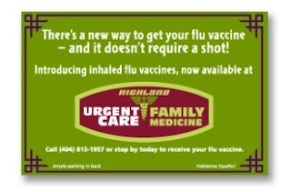
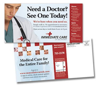
Postcards for Urgent Care Marketing


It seems there's a growth industry that's appeared without much fanfare.  It's called "Urgent Care" and it's made up of hundreds of local clinics that have found a niche somewhere between the Emergency Room and your neighborhood primary care doctor.

I've come across many postcards designed for Urgent Care marketing -- promoting the clinics to their nearby communities.
 
Urgent Care postcards have to accomplish many things: explain what 'Urgent Care' means, promote the clinic, provide contact and address details, and provide a call to action.  This can be a lot of work for a little postcard.

The best strategy is probably to break out the campaign into a series of cards with simple messages.

Each of the designs shown resides somewhere on that spectrum between simple and complex.  I'll let you be the judge of which part of that spectrum is most effective.

The final design, from our own sponsor at magnetbyMail, features a magnet mailer which has some added functionality.  It includes a customized magnet that can be kept in the home or office for months or longer.


------
Highland Urgent Care postcard designed by New Thought Marketing:

graphic design for marketing Highland Urgent Care


------
After Ours Urgent Care as found in the NCPA Health Blog .  (The blog has a good discussion of how Urgent Care is fitting into the national healthcare discussion.):

Local Healthcare Marketing


------
Immediate Care of Oklahoma postcard designed by Rick Boyd:


Marketing Urgent Care with direct mail


------
A postcard for a national industry awareness campaign from the Urgent Care Association of America:


Illustration based design for urgent care outreach


------
Boston Children's Hospital Urgent Care postcard designed by Micayla Boari (at Behance):

Micalya Boari design for urgent care postcard

------
The Maxcare UC layout: an urgent care postcard magnet mailer from magnetbyMail.com:


magnet mailer for urgent care